AI Subject Lines
Making AI-generated content easier to guide, evaluate, and keep on-brand.
I led content design and UX writing for an AI subject-line feature, from a five-day prototype through its general-availability design phase. Early testing revealed that generating options wasn't enough: marketers needed clearer inputs, meaningful tone choices, and persistent brand controls.
8
Defined tones

ROLE
Content design & UX writing
TIMELINE
2023–2024, 5-day hackathon prototype through GA launch
TEAM
2 PMs (lead + platform), Design, AI Engineering, Development
TOOLS
ChatGPT 3.5 (prototype), ChatGPT-4 (GA), Figma
01
THE CHALLENGE
The tool could generate options. Marketers still had to make them usable.
Movable Ink was introducing generative AI into Da Vinci to help enterprise email marketers produce subject lines at scale. The feature began as a five-day hackathon prototype, and I was the sole content designer shaping its UX writing strategy from the start.
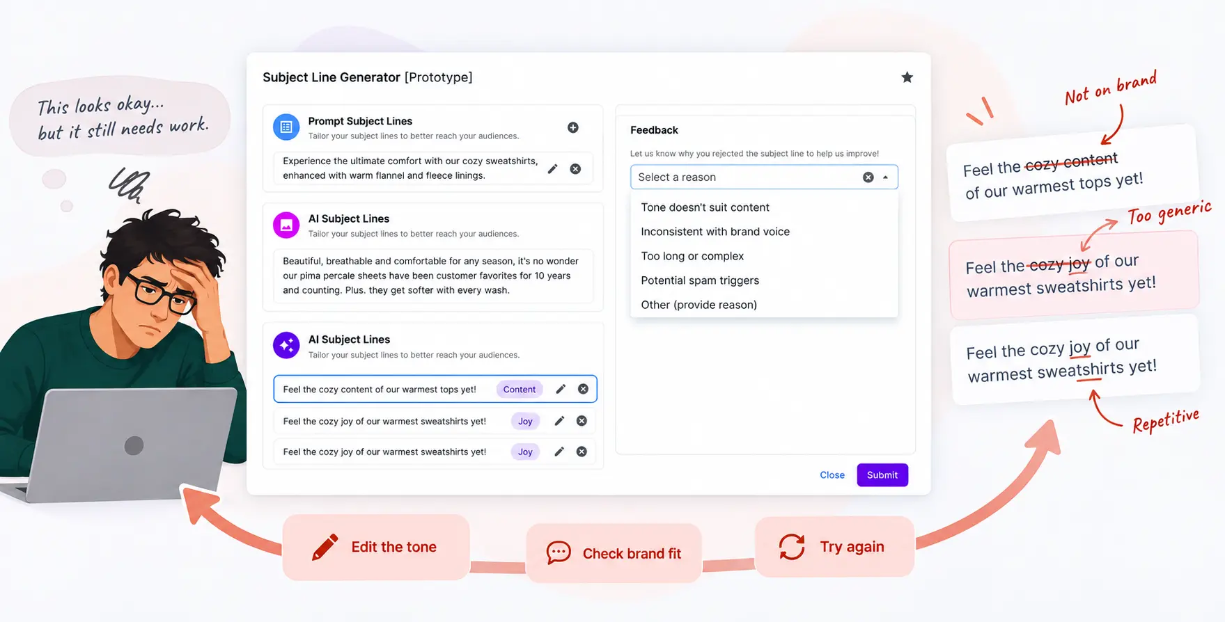
The prototype moved into early-access testing with three clients, which gave us the first real signal on whether the experience held up outside a demo. It didn't, not yet. Nearly every generated subject line was still being manually edited.
The problem wasn't the quality of individual suggestions, it was how little control marketers had over how those suggestions got produced. Tone options were hard to tell apart. Input guidance didn't consistently pull out the information that actually shaped good output. And there was no persistent way for a client to establish the brand rules they expected the tool to respect.
For enterprise marketers, a plausible subject line isn't automatically a usable one. It still has to reflect the campaign, the audience, the brand voice, and whatever publishing constraints apply. The design challenge shifted from helping people generate more options to helping them generate options they could actually direct and trust.
02
THE INSIGHT
The tool could generate, but not govern.
The early experience treated subject-line generation as a single prompt-and-response interaction. That was the whole design.
Testing showed that wasn't enough. Marketers didn't just need more output, they needed a way to communicate campaign intent clearly, choose a tone with confidence, and set constraints that stayed consistent every time they used the tool.
That became the actual design question for both phases: not "how do we get better subject lines out of the model," but "how do we give marketers a way to direct and trust what comes out of it."
03
THE SYSTEM
Three design principles, then a fourth once GA changed the job.
I built the UX writing strategy around four connected components. The first three addressed problems exposed by the prototype; the fourth emerged as the product moved toward general availability.
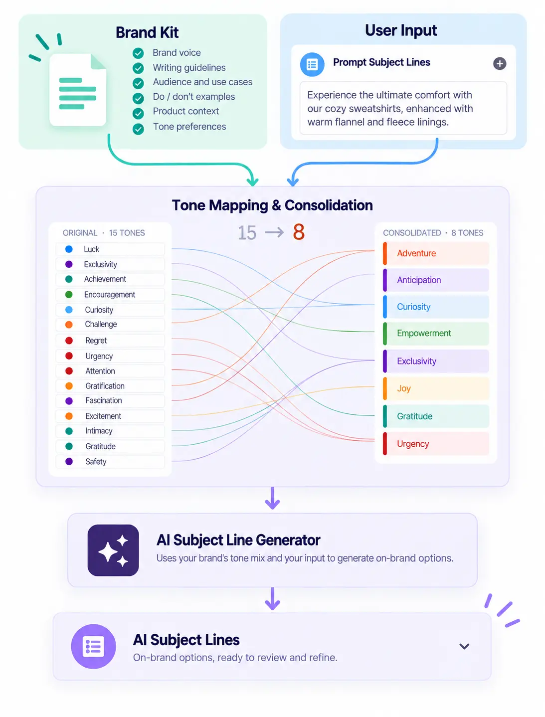
Input governance: I rewrote the helper copy around four specific signals—core benefit, target audience, brand voice traits, and keywords—and consolidated fifteen overlapping tone concepts into eight differentiated options.
Calibrated guidance: I matched explanatory copy to the model's capabilities, reducing instructions as its contextual understanding improved.
Expiring feedback: I introduced structured rejection reasons to turn subjective feedback into a consistent signal for the AI team, then removed the flow when it no longer justified the interaction.
Brand Kit: I helped design persistent, self-managed controls for voice, tone, character limits, emoji rules, and banned words, reducing the need to restate brand requirements in each session.
Together, these components shifted the experience from generating options toward giving marketers clearer direction and lasting control.

04
KEY DECISIONS
Four decisions that shaped the experience, including one I reversed.
01
Structure the input before refining the output
The prototype asked marketers for too little context. When generated subject lines missed the mark, users had to correct them manually. I rewrote the input guidance around four signals: core benefit, target audience, brand voice traits, and keywords. I also reduced fifteen overlapping tone concepts to eight differentiated options, using emotional posture, temporal focus, and customer positioning to make the choices more distinct. Rather than relying on users to repair every result, I focused on helping them express their intent before generation.
02
Match guidance to the model's capabilities
The five-day prototype needed substantial explanation. Users needed help understanding what to enter and what the model could reasonably do. As the GA model's contextual understanding improved, some of that guidance became unnecessary. I reduced the instructional copy while retaining support where it still served a purpose. The goal was to design for the product's current capabilities, not preserve instructions simply because an earlier version needed them.
03
Remove feedback when it stopped adding value
For the prototype, I designed a structured rejection flow that captured why users dismissed generated subject lines. Defined reasons made feedback more consistent and gave the AI team a clearer signal than open-ended dissatisfaction. As output quality improved toward GA, the flow no longer offered enough value to justify the extra interaction. I removed it. The decision wasn't to preserve everything we'd built. It was to keep only what the evolving experience needed.
04
Make brand rules persistent
Marketers needed a way to establish brand requirements without repeating them for every generation. I helped design the Brand Kit, a self-managed configuration system for voice, tone, character limits, emoji rules, and banned words. This shifted brand guidance from a repeated instruction into a persistent part of the product experience.
05
THE TRANSFORMATION
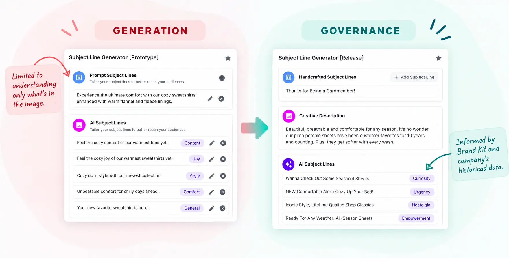
From generation to governance.
The tool didn't need to write better., but instead ask for the right things before it wrote anything.
BEFORE
Loose creative brief with little required structure.
Fifteen overlapping tone concepts.
Nearly every early output manually edited.
Brand requirements had to be restated.
AFTER
Four structured input signals.
Eight differentiated tone options.
Constraints incorporated before generation.
Brand Kit stores persistent configuration.
06
the outcome
From prototype to governed product.
The project moved from an early prototype focused on subject-line generation toward a GA design that gave enterprise marketers more structured ways to direct and govern the experience.
07
What I Actually Designed
Not just a prompt box. A content design system for AI.
My contribution extended beyond individual lines of interface copy.
Across the prototype and GA phases, I designed five connected layers of the experience: input guidance that helped marketers express intent; tone architecture that made choices more meaningful; contextual guidance that evolved with the model; structured feedback that I later removed; and Brand Kit content that made brand requirements persistent.
These decisions worked together to address different parts of the same problem: helping enterprise marketers direct AI-generated content without repeatedly correcting or re-explaining their requirements.
08
THE BIGGER IDEA
Generation is a feature. Governance is a product.
Most AI writing tools compete on how good their first draft is. That's a reasonable place to start, but it's not where enterprise usage actually breaks down. It breaks down when the same tool has to keep producing on-brand results for the same client, month after month, without someone rewriting the same instructions every time. A single good output proves the model works. A hundred consistent outputs prove the experience around it works. Designing for the first is a generation problem. Designing for the second is a governance problem, and it's the one that decides whether an AI feature survives contact with a real enterprise customer.
09
Reflection
AI experiences need to evolve alongside the models behind them.
This project reinforced that content design for AI isn't just about explaining a new feature. It's about understanding where users need to provide direction, where the system needs to communicate its limits, and which controls should persist beyond a single interaction.
The prototype needed more explanation and structured feedback. As the model improved, some of those interactions became unnecessary, while persistent brand governance became more important. The lesson I carried forward was simple: design for the problem users have now, and be willing to remove yesterday's solution when that problem changes.
Want to see the actual tone architecture, or what almost went wrong with the rejection flow before Brand Kit replaced it? Reach out and I can go into the details!